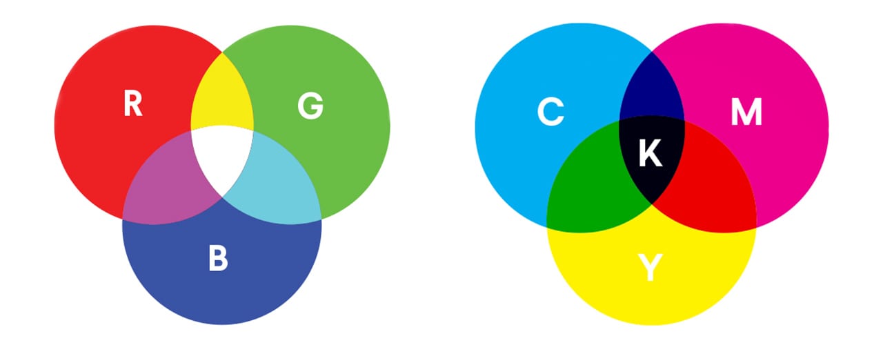
Whether you’re a designer or you’re getting a design, it’s important to know the difference between RGB vs. CMYK colour modes so you can plan and optimise each stage of the design process. That goes beyond just knowing what the letters stand for – spoiler alert: they’re mostly colours! – because it’s more about knowing which one is the best for your design project.
Depending on where and how the final result is displayed, one colour space is always better than the other.
Never fear these acronyms again: We’re going to explain what the RGB and CMYK colour modes are, how they work and when it’s best to use each.
- RGB is best for digital designs, including websites, social media, digital ads and screen-based graphics.
- CMYK is best for printed materials, including business cards, flyers, posters, packaging and branded merchandise.
- Some bright RGB colours can look duller in CMYK because screens use light and printers use ink.
- Soft proofing and hard proofing can help you preview how colours may print before placing a full order.
- For print, rich black and standard black create different effects, so it’s worth choosing the right one for your design.
What is the difference between RGB and CMYK?
Both RGB and CMYK are modes for mixing colours in graphic design. As a quick reference, the RGB colour mode is best for digital work, while CMYK is used for print products. But to fully optimise your design, you need to understand the mechanisms behind RGB vs. CMYK. Let’s dive deeper.
What is RGB?
RGB stands for Red, Green, Blue, which are the primary colours of light. In the RGB colour model, these three colours are combined in various ways to create a broad spectrum of colours. This model is widely used in electronic displays – when you look at a computer screen, a phone display or even your snazzy smartwatch, you’re seeing the magic of RGB at work.

RGB and additive mixing
Every digital screen is made up of thousands (sometimes millions) of tiny squares called pixels. Each pixel contains three even tinier lights: one red, one green and one blue of various intensity from 0 to 255. Mix all three at full blast (255, if we’re being technical), and you get pure white. Turn them all off, and you’re back to black.
The process of tweaking the brightness of these three lights is called additive mixing, and you can create 16.7 million possible colours using different RGB combinations.
When to use RGB?
If the end destination of your design project is a digital screen, use the RGB colour mode. This would go for anything that involves computers, smartphones, tablets, TVs, cameras, etc.
Turn to RGB over CMYK if your design project involves:
- Web and app design
- Icons
- Buttons
- Graphics
- Branding
- Online logos
- Online ads
- Social media
- Images for posts
- Profile pictures
- Profile backgrounds
- Visual content
- Video
- Digital graphics
- Infographics
- Photographs for websites, social media or apps
What are the best file formats for RGB?
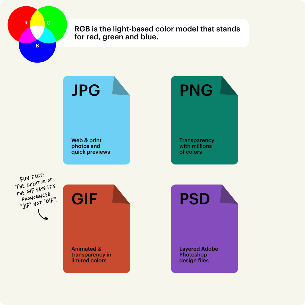
RGB file formats
JPEGs are ideal for RGB files because they’re a nice middle-ground between file size and quality, and they’re readable almost anywhere.
PSD is the standard source file for RGB documents, assuming anyone using the files is working with Adobe Photoshop.
PNGs support transparency and are better for graphics that need to be superimposed over others. Consider this file type for interface elements like buttons, icons or banners.
GIFs capture motion, so if you’re using an animated element, such as an animated logo or a bouncing icon, this file type would be ideal.
It’s best to avoid TIFF, EPS, PDF and BMP for RGB purposes. These formats are not compatible with most software, not to mention they can be unnecessarily large in terms of data.
What is CMYK?
CMYK stands for cyan, magenta, yellow and key (which stands for black, because “B” was already taken by blue in RGB), and it’s the go-to colour model for colour printing. Unlike the RGB model, which adds light to create colours, CMYK works by subtracting light absorbed by inks.

CMYK and subtractive mixing
Imagine each ink colour as a filter:
- Cyan (C): This greenish-blue hue absorbs red light and is one of the primary printing inks.
- Magenta (M): A purplish-pink colour that absorbs green light, magenta is another key player in the printing process.
- Yellow (Y): This bright, sunny colour absorbs blue light, rounding out the trio of primary colours in CMYK.
- Key (K) or black: The black ink, known as “key” because it provides the key detail and contrast, absorbs all colours of light. It’s essential for adding depth and sharpness to printed images.
The more ink you layer on, the less light gets through, which is why mixing these colours results in darker shades. In CMYK, colours are measured in percentages. When you lay down all four colours in high percentages, you achieve a rich, deep black.
When to use CMYK?
Use CMYK for any project design that will be physically printed, not viewed on a screen. If you need to recreate your design with ink or paint, the CMYK colour mode will give you more accurate results.
Turn to CMYK instead of RGB if your project involves:
- Branding
- Business cards
- Stationery
- Stickers
- Signs and storefronts
- Advertising
- Billboards
- Posters
- Flyers
- Vehicle wraps
- Brochures
- Merchandise
- T-shirts, hats and other branded clothing
- Promotional swag (pens, mugs, etc.)
- Essential print materials
- Product packaging
- Restaurant menus
Designing for print means being aware of how much ink you’re laying down. Overdoing it can cause smudging and even tearing of the paper. That’s why designers often use variations like cool black (C: 60%, M: 0%, Y: 0%, K: 100%), warm black (C: 0%, M: 60%, Y: 30%, K: 100%), or designer black (C: 70%, M: 50%, Y: 30%, K: 100%) for different effects and materials, or depending on the latest colour trends.
Standard black vs. rich black
Standard black usually means 100% K, using black ink only. It’s best for things like small text, fine lines and details because it keeps edges nice and crisp.
Rich black uses black plus percentages of cyan, magenta and yellow. A common example is C: 60%, M: 40%, Y: 40%, K: 100%. It can create a deeper, fuller black for large background areas, posters or premium print designs.
What are the best file formats for CMYK?

CMYK file formats
PDFs are ideal for CMYK files because they are compatible with most programs.
AI is the standard source file for CMYK, assuming anyone working with the files is using Adobe Illustrator.
EPS can be a great source file alternative to AI because it is compatible with other vector programs.
All things considered, it’s always best to consult your printer beforehand to find out which file format they prefer.
How to set up RGB vs. CMYK colour modes in design programs
If you’re using Adobe software, here’s how to set up your colour mode for a new project.
How to set the colour mode in Photoshop
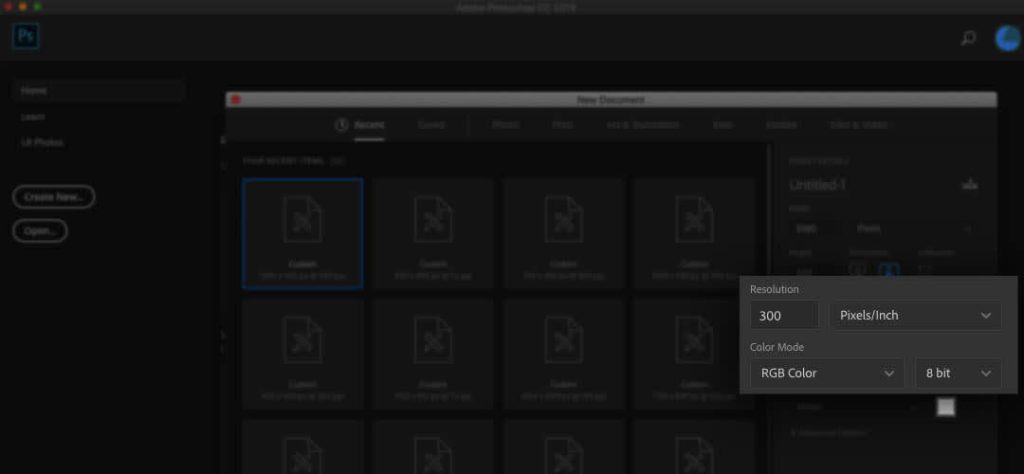
The Colour Mode setting in Photoshop is included in the New Document window
When you create a new document in Photoshop, the colour mode option will be included with other parameters in the New Document window.
How to set the colour mode in Illustrator
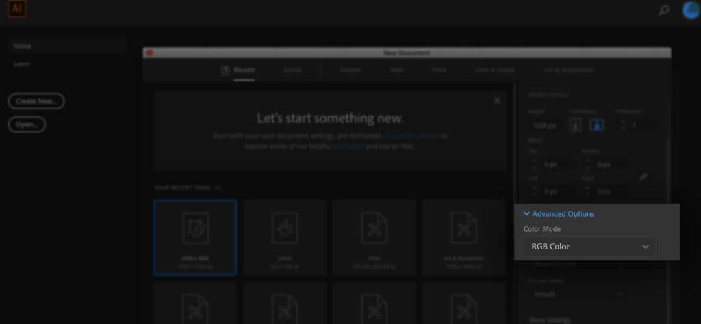
The Colour Mode setting in Illustrator is hidden within the Advanced Options menu in the New Document window
When you create a new document in Illustrator, the colour mode option will be hidden under the Advanced Options collapsible menu. Click on the arrow to expand this menu.
How to set the colour mode in InDesign
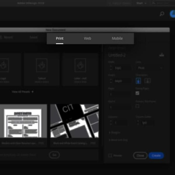
The colour mode is automatically set depending on whether you choose a Print (CMYK) or Web/Mobile (RGB) document
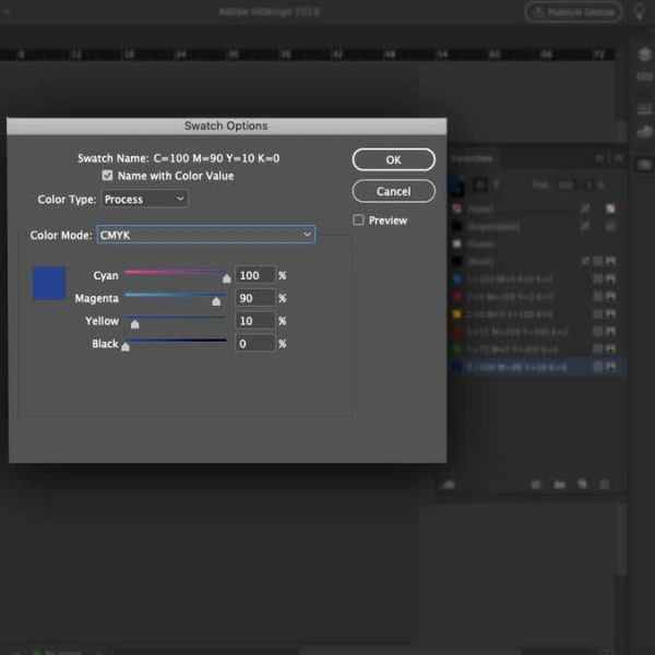
You can set the colour space of individual swatches by using the Colour Mode dropdown menu in the Swatch Options panel
InDesign automatically sets the default colour mode depending on which type of document you choose (either in the print or web/mobile category, which translates to CMYK or RGB, respectively).
When you work with colours inside the program, you’ll notice that swatches will already be measured in RGB or CMYK values, depending on which type of document you are working in. Because InDesign allows you to mix colour spaces, you can change the colour mode of individual swatches whenever you create one, but in general, it is best to keep colours consistent.
How to check whether your document is in RGB or CMYK mode
Since RGB and CMYK aren’t interchangeable, it’s important to be 100% certain about the colour mode you’re working in. Printing an RGB file instead of converting it to CMYK can lead to some… interesting results, and not in a good way.
RGB colours often appear brighter and more vivid because they’re created with light. However, printers can’t replicate this exact vibrancy with ink. When you print in RGB, the printer has to convert those colours to its closest CMYK equivalent. This conversion process isn’t perfect and can cause your colours to look muted or even drastically different. That electric blue on your screen? It might turn out as a duller, less exciting blue on paper.
Moreover, certain colours in RGB simply don’t exist in the CMYK spectrum. Neon colours, for example, are notorious for looking fantastic on screen but failing to impress in print. This is because RGB can produce millions of aesthetic colours by blending light, while CMYK’s ink combinations are more limited.
Modern screens can also make the difference feel more dramatic. Many newer phones, laptops and monitors use wide-gamut display technology, such as Display P3, which can show more vivid colours than older screens.
That means a bright RGB design might look great on your device, but then it’s more muted once it’s converted for CMYK printing.
In practical terms, here’s what happens when you try to print an RGB file instead of CMYK:
- Colour shifts: Bright and neon colours lose their pop.
- Duller prints: Overall, your print might look less vibrant.
- Unexpected results: Some colours might change entirely, leading to a less accurate representation of your original design.
To avoid such mishaps, make sure you’re working in the correct mode.
If you can’t remember what mode you set your document to or if you are working with someone else’s file, here’s how you check the colour mode.
Why AI-generated colours can shift in print

Vibrant AI art via Depositphotos
Many AI image tools create artwork in RGB, often with very bright, saturated colours.
But the same RGB-to-CMYK issue still crops up. When the file is converted to CMYK, some of that brightness may get lost because standard print inks can’t reproduce every colour a screen can display. That’s why, before printing AI-generated artwork, it’s best to convert the file to CMYK, check for any colour shifts and use a proof if the design depends on very specific colours.
How to check the colour mode in Photoshop

Image > Mode
In Photoshop, the colour mode is listed in parentheses in the document’s tab. You can also find it by navigating to Image > Mode. The document’s colour mode will have a checkmark next to it.
How to check the colour mode in Illustrator

File > Document Colour Mode
In Illustrator, the colour mode is listed in parentheses in the document’s tab. You can also find it by navigating to File > Document Colour Mode. The document’s colour mode will have a checkmark next to it.
How to check the colour mode in InDesign
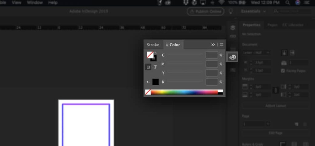
CMYK colour mode is shown in the Colours panel
One easy way to check the colour mode in InDesign is to use the Colour panel. Navigate to Window > Colour > Colour to bring up the Colour panel if it is not already open. You will see colours measured in individual percentages of CMYK or RGB, depending on your document’s colour mode.
How to proof colours before printing
The last thing you want is to print off 500 copies only to realise the colours aren’t quite right. That’s why, before you go ahead and print, it’s important to test your colours.
There are two ways to proof before printing:
- Soft proofing
- Hard proofing
What is soft proofing?
Soft proofing is a digital preview that uses colour profiles, which are often ICC profiles, to simulate what your design might look like when it’s converted for print. You can do this with design programs like Adobe’s Photoshop. It’s not a perfect match for a physical proof, but it can help you catch any obvious errors early.
What is hard proofing?
A hard proof is a physical test print. It’s a more reliable way to check your colours than an on-screen preview because it shows how ink, paper stock, finish and printer settings will affect the final result.
It also gives you the confidence of seeing what it will look like in real life before you commit to printing large numbers.
When should you use each?
Both of these methods have their uses, but it really depends on what matters to you most.
- Use soft proofing when you want a quick check before exporting or sending artwork to print.
- Use hard proofing when colour accuracy really matters, such as for brand colours, packaging, signage or a large print run.
How to convert between RGB and CMYK
Some of you may be thinking, “Well, this article would have come in handy when I first started the project!”
Don’t despair. Yes, it’s important to start a project in the correct format, but it’s still possible to convert between RGB and CMYK if you need to.
Be prepared for the colours to look different (darker or lighter due to additive or subtractive mixing). In addition to changing the document’s colour space, you may need to change the colours themselves to find an approximation of what you had before.
Here’s how to use design software to convert between RGB vs. CMYK colour modes.
How to change the colour space in Photoshop

Edit > Convert to Profile

Use the Destination Space dropdown menu to change the colour mode
To change the colour mode of your Photoshop document, navigate to Edit > Convert to Profile. This will bring up a dialogue box. What you want to pay attention to is the Destination Space field. Use the dropdown to select your desired colour mode.
There are different libraries of RGB and CMYK colours, which is why you will see multiple options. For general purposes, the first two options are fine, but you may want to check with your printer beforehand to be sure of what they need.
If your image is not already flattened, check the Flatten Image to Preserve Appearance box, as your colours may not come out as well in multiple layers with blending/transparency between them. Once you’re ready, hit OK, and you will see the colour mode information change in the tab at the top of your document.
How to change the colour space in Illustrator
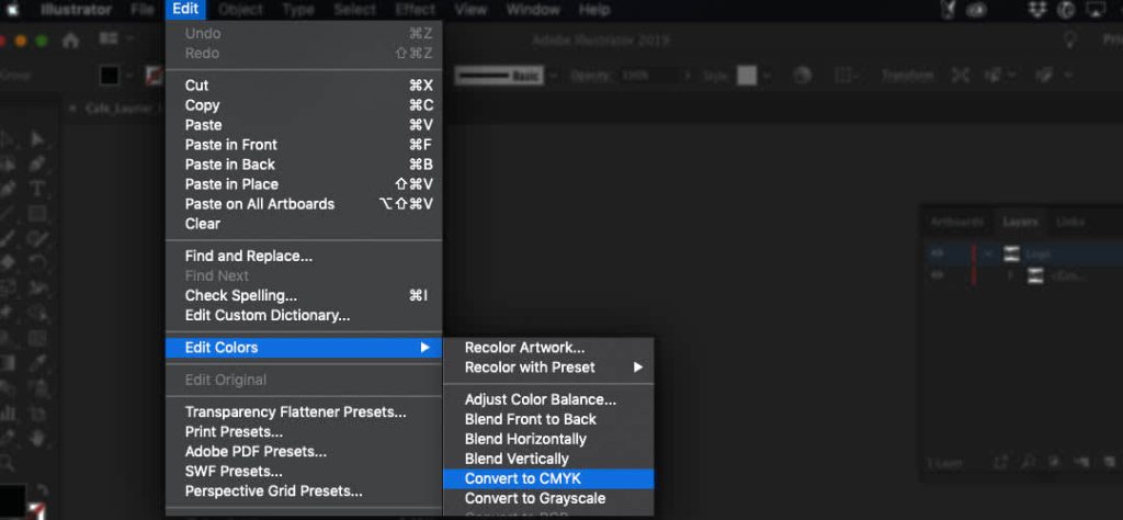
Edit > Edit Colours, select the colour space you want to convert to
To change the colour mode of your Illustrator file, select all objects in your document. Navigate to Edit > Edit Colours and select your desired colour space.
How to change the colour space in InDesign
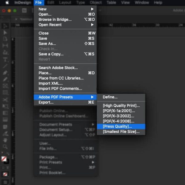
File > Adobe PDF Presets > [Press Quality]

Select Output on the left side and use the Destination dropdown menu to convert the colour mode
You can change the colour mode of your InDesign document in the export process. Navigate to File > Adobe PDF Presets > [Press Quality] and select a save destination. In the Export Adobe PDF pop-up box, select Output on the left side and use the Destination dropdown menu in the Colour section to choose your desired colour mode.
This method can be helpful in a pinch, but if you are working with a lot of different images, it is best to change the image’s colour mode through its native program (like Photoshop or Illustrator), assuming they have been linked.
Know your colour modes
Knowing how the colours interact to define a pigment can give you greater control over how the final colour looks and, therefore, greater control over your final design. The more you work within a particular colour mode, the better you’ll get at predicting how the design file will translate to an end product. That’s why, if you want picture-perfect colours every time, it’s best to hire a professional designer through VistaPrint’s Design Services.
Frequently asked questions
Is it better to design in RGB or CMYK?
Use RGB for anything that will be viewed on a screen, like websites, social media graphics, digital ads and videos. Use CMYK for anything that will be printed, like business cards, flyers, posters, packaging, menus and stickers.
What happens if I print an RGB file?
The printer will convert the RGB colours into CMYK. Some colours may print accurately, but bright or highly saturated shades can look duller, darker or less vibrant. To avoid any surprises, convert your file to CMYK before printing and check how the colours change.
Can you convert RGB to CMYK without losing colour?
You can convert RGB to CMYK, but some colour change is normal. RGB can display brighter colours than CMYK can recreate with ink. If colour accuracy matters, proof your design before printing.
Why does my blue look purple when printed?
Blue can look purple in print when there’s too much magenta in the CMYK mix. This can happen when bright RGB blues are converted for print. Check the CMYK values before printing and reduce the magenta if the blue is leaning too purple.
Does Canva use RGB or CMYK?
Canva is often used for digital RGB designs, but it also offers CMYK options for print. If you’re designing business cards, flyers or other print materials in Canva, use CMYK colours where available and download your file as a print-ready PDF.