Business cards are all about making connections. Much more than simply eye-catching, the right colour combinations on business cards are invaluable tools for visual communication that work subconsciously to reinforce your brand, foster an emotional connection with the viewer and bolster that all-too-important first impression.
But the wrong colour combinations not only make a card look unprofessional, they could also make it illegible. When it comes down to it, picking the best colour combination is part intuition, part science. It’s ultimately about who you are and what you want the reader to feel. To help demystify this process, we’ll walk you through every consideration for finding the best colour combination for your business card.
Can’t wait to put these principles into practice? Start exploring colour combinations on business cards with VistaPrint—and get them printed when you find the perfect pair.
The science of business card colour combinations
Colour wheel
The colour wheel is a pictorial representation of how colours appear in light. Essentially, it’s the rainbow rendered in circular form. Designers create colour schemes using the relative location of each colour on this wheel. This approach takes the guesswork out of finding colour combinations—the results are mathematically assured!
[Image needed: colour wheel diagram showing the various schemes]
Here are the most common colour wheel schemes:
- Analogous colours are next to one another
- Complementary colours are opposite from one another
- Triadic colours are three colours equidistant from one another
The colour wheel is made up of primary hues—that is, the pure version of the colour. When crafting unique colour combinations, be sure to consider saturation (adding brightness, or tint to the hue) and value (adding darkness, or shade to the hue). With digital colour wheels (like Adobe Colour), saturation and value are usually represented by depth, with the center being pure black and the outer rim being pure white.
Pro tip: With a single hue (or an analogous colour scheme), you can vary the saturation and value to give your business card a soft gradient.

By Jecakp via 99designs by Vista
Colour psychology
Colour psychology describes the way that colours make viewers feel. Through experience and cultural reinforcement, we subconsciously associate each colour with an emotion. Designers choose colour combinations with these associations in mind to strategically communicate. For business cards, choose colours whose associations support one another and speak to your brand values.
[Image needed: something representing colour psychology]
Some common Western colour associations are:
- White – neatness, purity
- Black – power, seriousness
- Grey – formality, convention
- Brown – honesty, dependability
- Red – danger, passion
- Orange – creativity, safety
- Yellow – happiness, unpredictability
- Green – nature, life
- Blue – security, stability
- Purple – royalty, spirituality
Warm colours vs. cool colours
In addition to emotional associations, colours have a temperature and contrasting or harmonizing these temperatures is another way to come up with dynamic colour schemes. This can be literal (red for fire, blue for ice), but a more helpful way to think about temperature is energy. Bright, high energy colours read as warm, whereas mellow, muted colours will read as cool.
[Image needed: the below colours split up into warm and cool, maybe in another wheel shape]
- Warm colour examples: orange, red, yellow
- Cool colour examples: blue, purple, green
Natural colours
Natural colours are those we associate with specific imagery in our everyday world. By drawing on the power of the environment, natural colours give a visceral, material sense in addition to emotional associations. Consider how an environmental brand uses green to symbolise earth whereas a luxury brand might use another shade of green to symbolise money.

By HYPdesign via 99designs by Vista
Tips for effective colour combinations on business cards
How many colours to use
There is an infinite variety of colours you can potentially combine, but space on a business card is limited. Because colour is a supporting player—the actual information is the star—using too many colours can distract.
By conceptu via 99designs by Vista
Many businesses pair a single colour with neutral tones like white, black or grey. With two colours, one main colour does the heavy lifting while a secondary, accent colour highlights important details. Even for expert designers, three or more colours on such a small space is difficult to pull off. For your first business card design, we recommend colour combinations of no more than two.
Using colour for contrast and emphasis
Beyond emotional communication, one of the most important jobs that colour does is aid readability through contrast and emphasis. Contrast makes sure that design elements are visually distinct by setting dark colours against light colours—or vice versa. Consider how hard on the eyes sunny yellow text on a lime green background would be!
By Rose ❋ via 99designs by Vista
Emphasis involves using colour as visual landmarks to draw the eye to important details first. A common strategy is to colour the icons next to the contact information so that readers can quickly find an email or phone number when they need it. This is where an accent colour comes in handy—the eye naturally picks out what is rare.
Which business card elements typically receive colour
Any part of a business card can receive colour, but there are some common areas designers typically choose for better visual communication. First and foremost, colour should be placed in a way that enhances the reading experience.

By Bojana. via 99designs by Vista
- Background – As the biggest canvas on the business card, the background can establish the overall mood. Designers will often colour the whole background (especially on the back of the card) or will craft abstract background shapes out of solid colours, gradients, patterns or other techniques.
- Text – Text is usually given colour to stand out from the background or to distinguish other, lower priority text. Unless colour is specifically needed for either of these reasons, it’s usually best to stick with plain black or another dark colour.
- Icons – Icons are often given an accent colour to draw the eye quickly to them.
- Graphics – Graphic elements like a logo, photo or illustration will come with their own set of colours. To avoid excess colours, it’s best to reuse logo and brand colours.
Logo colours and branding
If you’re an established business, you may have created a logo and brand identity (if not, we’ve got you covered). In this case, your colour combinations are already decided—reuse those colours for your business card to foster brand consistency. In cases where your brand colours may be too bold to adapt in large portions to a business card, introducing neutrals like black, white or grey is a great alternative.

By Arthean via 99designs by Vista
Understandably, many working professionals won’t go to the trouble of creating a personal logo for their business card. If this sounds familiar, you still have to think of yourself as a brand in order to decide what colour combinations will foster the right impression.
Colour combinations and black and white
While not technically colours, it’s helpful to think of neutrals like white, black and grey as important to consider for colour combinations. Keep in mind that all colour combinations will interact with neutrals in addition to each other.

By Hasanssin via 99designs by Vista
Along these same lines is whitespace, sometimes called negative space—the empty parts of your business card. Although whitespace is empty, that doesn’t mean the viewer doesn’t see it, and there’s even a psychology to that emptiness. Large amounts of whitespace (whether or not it’s actually white) creates a sense of lightness and serenity. A busy, full card conveys weight and boldness.
Business card material
Printed business cards are a tactile experience, and there are various textures that can affect how the colour is displayed. Foil adds a metallic sheen, embossing creates natural shadows and even the card material can add a roughness that deepens the colour.

By hyakume via 99designs by Vista
It’s sometimes tempting to treat these finishing touches as exactly that—last minute purchases. But because they can dramatically change the way colour comes across, plan for materials and textures early on in your colouring process. Even after you’ve chosen your colour combinations, print out a test card before putting in a full order to make sure nothing gets lost in the translation from digital to physical.
Best business card colour combinations
Whites and golds
Ivory and gold are both associated with wealth. Gold itself can be gaudy if overused, so as an accent colour, it pairs perfectly with the neutral blankness of white. This combination creates a clean, minimalist aesthetic with a subtle touch of glamour suitable for luxury brands.

By ultrastjarna via 99designs by Vista
Blacks and silvers
In our digital age, black and silver have an immediate correlation with tech devices. This metallic colour combination expresses innovation and modernity. While black on its own is somber, silver adds a touch of dashing sleekness. As a subtle pairing—you might not even notice the silver foil until the light hits it—this intentional subversion of attention shows confidence.

Caption: By conceptu
Grays and oranges
In the suit-and-tie business world, bold colours like orange get a bad rap as childish. Pure neutrals like grey, while adequately adult, suggest lifeless conformity. But together, orange and grey invite warmth with buttoned-up professionalism, particularly when orange is the accent colour.

By Prozmajevski via 99designs by Vista
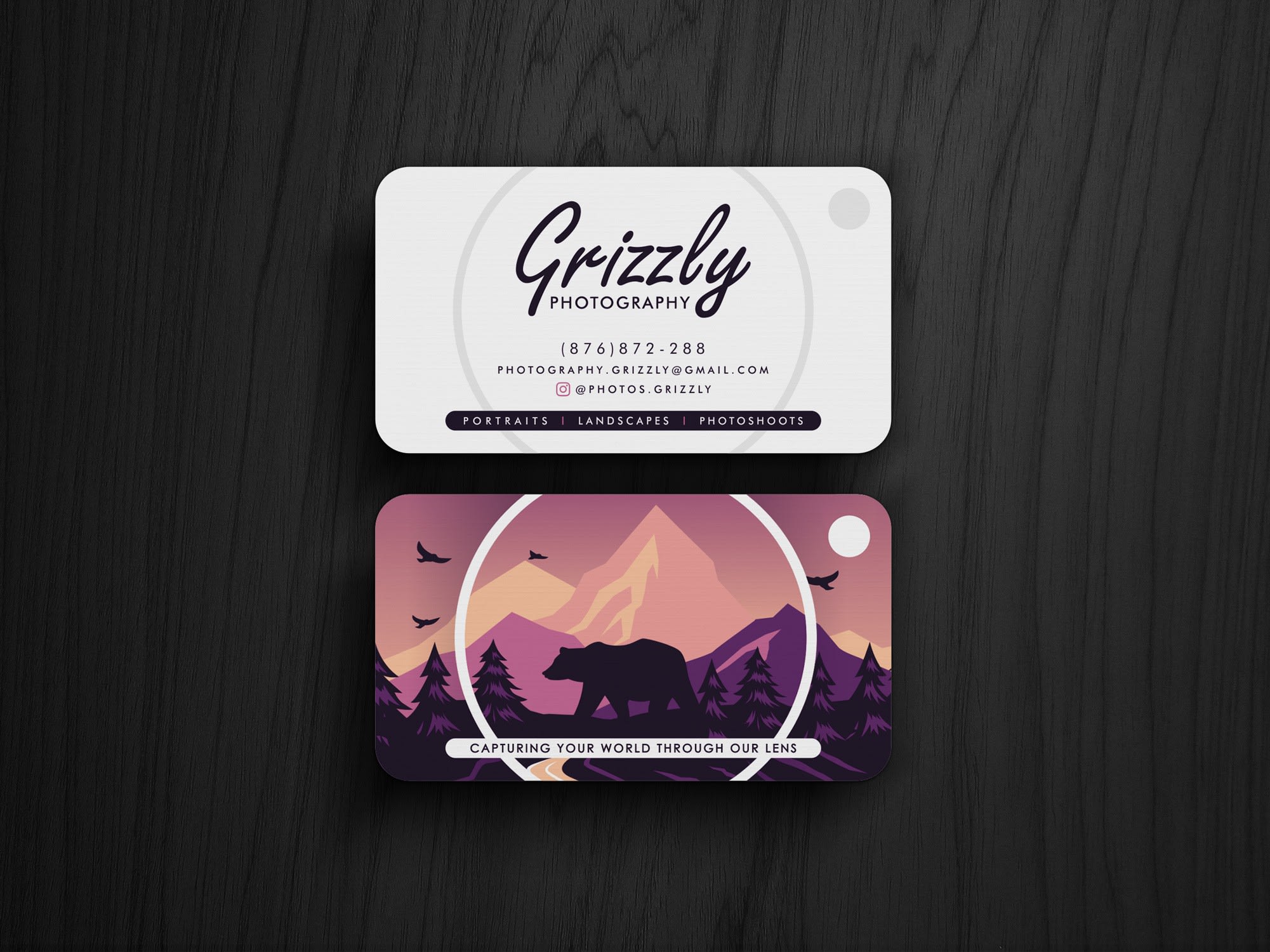
Blues and greens
Blues and greens have natural associations with the plants and water, making them the go-to combination for environmental brands. But somewhat contradictorily, neon varieties of blue and green are reminiscent of the unnatural lights of computers, making them a popular choice for tech or future-focused brands.

By smashingbug via 99designs by Vista
Reds and blues
The combination of red and blue is reminiscent of childhood, bolstered by its popularity with superhero costumes. In their lighter forms (pink and baby blue), these colours have stronger connotations with babies. Generally, this combination is great for brands whose work involves children or may be going for nostalgic, playful—even sporty—effect.

By pecas™ via 99designs by Vista
Purples and yellows
Even in darker shades, purple has a vibrancy that pairs well with the joyful warmth of yellow. Like most energetic colour combinations, it’s easy to go loud with both of these colours, which is why they are useful for bold, risk-taking brands. In the pictured example, these colours grab the viewer’s attention to pique their curiosity with a cryptic logo and QR code.

By bo_rad via 99designs by Vista
Oranges and blues
Orange and blue is a classic and surprisingly versatile complementary combination. While lighter versions of each colour come across as youthful, darker versions fit right at home in professional business settings. In addition to offsetting warm against cool, blue’s associations with stability and trust are a perfect counterweight to the creativity and daring of orange.

By Jecakp via 99designs by Vista
Blacks and pinks
Black and pink are a high contrast pair in more ways than one. In terms of their actual colour, you have light versus dark, and in terms of their psychology, you have danger versus innocence. The colours are an irresistible pair of opposites, cuteness with an edge, for business cards that want the best of both worlds.

By Yokaona via 99designs by Vista
Reds and browns
Red and brown (especially a lighter beige) reminds viewers of desert settings, lending a rustic ambiance to business cards. For this reason, the combination is useful for brands with a rugged, outdoorsy vibe, like a woodworking business.

Caption: By ludibes
Blues and yellows
As a cool colour, blue balances out sunnier hues, which is why a yellow accent can add a dose of warmth in a moody sea. Both colours naturally harmonise triggering peaceful associations (that of serenity for blue and joy for yellow) while the temperature contrast creates irresistible visual tension.

By Moxie Mason via 99designs by Vista
Yellows and browns
Yellow and brown are an analogous earth-tone colour combination. Because they lack the vibrancy of environmental colours like green or blue, this combination has a muted sensibility that evokes salt-of-the-earth maturity.

By velvetmade via 99designs by Vista
Get started combining colours on your business card
Between visual communication and emotional resonance, colour combinations do important work on business cards. While reading and understanding how colour combinations work is a great start, there’s no substitute for practice. With tools like VistaCreate, you can quickly mockup business cards to test out colour combinations before committing. When you’re ready, you can easily upload, customise and print your business card designs through VistaPrint.